Who am I?
My name is Bartosz Czapiewski.
I come from Poland and live in Warsaw.
I run two most popular blogs in Poland dedicated to:
- Data visualization & dashboard design – SkuteczneRaporty.pl
- Power Query, Power Pivot, Power BI – ExcelBI.pl
Since 2010 I run trainings in Polish and English, many of which are Fortune 500 companies, like Coca-Cola, 3M, BMW, Danone. At Excel BI Academy I gathered all my knowledge and expierence from +100 live trainings on:
- Power Query for Excel & Power BI
- Power Pivot aka Data model & DAX language
- Power BI
- Data Visualization & Dashboard design
Since 2020 my courses are available online at Excel BI Academy.
Effective Reports = Automation + Visualization and Analysis + Good Decision
English term Effective Reports (SkuteczneRaporty in Polish) has become my company name.
Where did my interest in dashboards come from?
It was 2009 when, while working as an analyst in an international company from the financial industry, I was asked by my supervisor to prepare a “dashboard”. The word sounded strange to me, so I checked it thoroughly in a search engine, where I found car dashboards and analogous dashboards showing business results. Both forms had two important features – they fit on one screen within the sight of the recipient and present numbers in a graphic and visual form. It was a completely different approach than the one I had known before. Traditional reports, most common in companies and organizations, contain thousands of columns of numbers spread over multiple sheets. While looking for the best dashboard building practices, I came across the principles of data visualization, i.e. an approach that starts with how the human brain works in the context of data analysis. Only by combining these two elements – correct data visualization and dashboards, we make working with reports much easier.
Why do I think this is important?
Every day, millions of people around the world create reports in the form of text, tables, charts and graphics, the purpose of which is to convey information and share knowledge to the recipient. Reports are both a compilation of business data, a financial report or a press article. We are an information society where the ability to collect, process, analyze and present information is extremely valuable. Especially in business, reports are worth their weight in gold as they are the basis for making everyday decisions. Their accuracy largely depends on the effectiveness of the report. Here are my insights on data visualization:
- Most of the people who create charts cannot handle them properly.
The most popular charts (e.g. pie charts) are among the least effective. - It is fashionable to “colorize” reports that is contrary to the work of the brain.
- The most popular computer programs that are used to visualize data, including Microsoft Excel, mislead the user and violate the basic principles of data visualization.
- The charts that appear in the press and reports also mislead the public.
- The concept of dashboards was reflected only in Excel 2013, in a way so camouflaged that few users will discover it.
- Data visualization is not a subject that is taught at any economic university in Poland, nor is it included in MBA programs.
My social responsibility


From the beginning, the goal was one: to provide high-quality, free knowledge for every analyst. And it has remained so until today. Moreover, since many people write to me with their problems, I often give free advice.
At Excel BI Academy I made available a free 13-hour Excel course, thanks to which everyone can gain new skills and confirm them with a certificate. It is also a great replay for people who are getting ready to continue their journey with the Power add-ins.
Excel BI Academy opened its doors to all NGOs, thanks to which knowledge is used by employees, among others Polish Humanitarian Action, the Wiosna Association (organizing the Szlachetna Paczka) or UNICEF.
Since 2018, 5% of the gross value from each sold course is donated to support the actions that I care about:
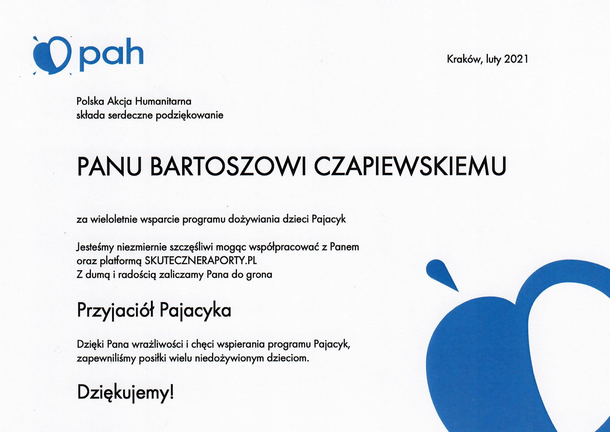
07.2019-12.2020 – I supported the Pajacyk campaign organized by the Polish Humanitarian Organization by financing meals for malnourished children. Together with the clients of SkuteczneRaporty.pl, who trusted the Academy’s project, we funded as many as 3,000 meals.
01.2021 – now – by purchasing the course, you support the Judo Lemur sports club with me, helping young athletes to pursue their dreams. I support “Lemurs” because:
- The club has a clear purpose: to educate and train the Olympic Champion in Judo
- Trainers place great emphasis on the personal culture of children and young people as well as their education.
- “Lemurs” shape values that are important to me: diligence, honor, passion, courage, respect.
- The coronavirus pandemic has limited the club’s development opportunities.
My library


